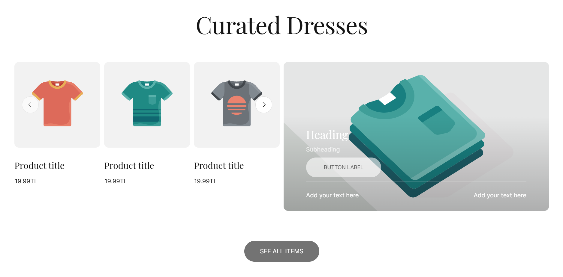

| Setting | Description |
|---|---|
| Section width | 3 options for container
|
| Color scheme | Select colors from Theme settings -> Colors |
| Heading | The title of the section |
| Description | The description of the section |
| Content alignment | The position of the heading and description.
|
| Show view all button | When enabled, it will display a button with a link to the collection page |
| Collection | The products collection will be displayed |
| Maximum items to show | Limit the display of the number of posts. Minimum: 2. Maximum: 25 |
| Items per row on desktop | Number of columns to display on desktop computers. Minimum: 2. Maximum: 5. |
| Column gap | 4 options for column gap
|
| Setting | Description |
|---|---|
| Enable carousel | When enabled, the section will be displayed in carousel format |
| Show navigation | Display the next and back controls for the carousel |
| Show pagination | Display the pagination for the carousel |

| Setting | Description |
|---|---|
| Heading, Subheading, Description | Custom content block |
| Size | The size of content block |
| Spacing bottom | Spacing between the content and the next component |
| Setting | Description |
|---|---|
| Button label | Custom button name, if left empty, the button will be hidden |
| Button link | The URL you want to attach to this button |
| Use outline button style | Change the primary button layout into outline layout |
| Spacing bottom | Spacing between the content and the next component |
| Setting | Description |
|---|---|
| Text #1 | Define the left side content |
| Text #2 | Define the right side content |
| Size | The size of content block |
| Enable letter spacing | Enable the preset letter-spacing of Agile theme |
| Button label | Custom button name, if left empty, the button will be hidden |
| Button link | The URL you want to attach to this button |
| Use outline button style | Change the primary button layout into outline layout |
| Show border top | Show a border on top of the content block |