> For the complete documentation index, see [llms.txt](https://nextsky.gitbook.io/agile-theme/llms.txt). Markdown versions of documentation pages are available by appending `.md` to page URLs; this page is available as [Markdown](https://nextsky.gitbook.io/agile-theme/sections/promotion-banner.md).

# Promotion banner

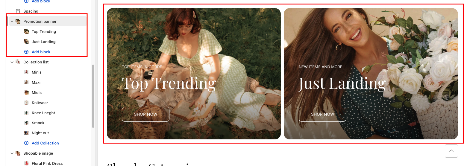
A **Promotion banner** on a website effectively highlights promotions, includes compelling calls to action, engages users, boosts sales, enhances visual appeal, delivers key information, and creates a sense of urgency, benefiting the website's overall performance.

<figure><img src="/files/TAd7PGx0scI6diFWOLgP" alt=""><figcaption></figcaption></figure>

## Section settings

### General settings

<table data-full-width="false"><thead><tr><th width="143">Setting</th><th>Description</th></tr></thead><tbody><tr><td>Section width</td><td><p></p><p>3 options for container</p><ul><li>Stretch width: span the section width regardless of screen size.</li><li>Fix width: depends on your page content width in <strong>Theme settings</strong> <strong>-></strong> <strong>Layout</strong>.</li><li>Expand full width: takes up the entire space on the page and it usually resizes itself to fit the size of the screen.</li></ul></td></tr><tr><td>Column gap</td><td><p>4 options for column gap</p><ul><li>Small</li><li>No gap</li><li>Medium</li><li>Large</li></ul></td></tr></tbody></table>

### Section padding

* **Top padding:** Customize the top margin of the section
* **Bottom padding:** Customize the bottom margin of the section

## Block settings

### Block setting general

<table data-full-width="false"><thead><tr><th width="143">Setting</th><th>Description</th></tr></thead><tbody><tr><td>Vertical alignment</td><td><p></p><p>3 options for the vertical alignment</p><ul><li>Top</li><li>Middle</li><li>Bottom</li></ul></td></tr><tr><td>Width</td><td><p>Adjust the width between the block</p><ul><li>20%</li><li>25%</li><li>33%</li><li>50%</li><li>66%</li><li>75%</li><li>80%</li><li>100%</li></ul></td></tr></tbody></table>

### Image with text overlay & Image with text bellow

<table data-full-width="false"><thead><tr><th width="143">Setting</th><th>Description</th></tr></thead><tbody><tr><td>Image</td><td>Upload desired image</td></tr><tr><td>Mobile image</td><td>Upload desired image mobile</td></tr><tr><td>Color scheme</td><td>Select colors from <strong>Theme settings -> Colors</strong></td></tr><tr><td>Image overlay opacity</td><td>Customize the image overlay opacity</td></tr></tbody></table>

#### Mobile layout

* Show text bellow on mobile: Content beneath the image
* Reset color scheme setting on mobile: When enabled, the content color will be displayed in the default color scheme

#### Content setting

<table data-full-width="false"><thead><tr><th width="143">Setting</th><th>Description</th></tr></thead><tbody><tr><td>Subheading</td><td>Subheading content</td></tr><tr><td>Heading</td><td>Heading content</td></tr><tr><td>Description</td><td>Description content</td></tr><tr><td>Button label</td><td>Button content</td></tr><tr><td>Button style</td><td><p>The style of the button</p><ul><li>Fill</li><li>Outline</li></ul></td></tr><tr><td>Button link</td><td>The link URL you want to add</td></tr><tr><td>Desktop content position</td><td><p>3 options for the desktop content position</p><ul><li>Top</li><li>Middle</li><li>Bottom</li></ul></td></tr><tr><td>Content alignment</td><td><p></p><p>3 options for the content alignment</p><ul><li>Left</li><li>Center</li><li>Right</li></ul></td></tr><tr><td>Size</td><td><p>Font size content customization</p><ul><li>Small</li><li>Medium</li><li>Large</li></ul></td></tr></tbody></table>

### Image&#x20;

<table data-full-width="false"><thead><tr><th width="143">Setting</th><th>Description</th></tr></thead><tbody><tr><td>Image</td><td>Upload desired image</td></tr><tr><td>Image link</td><td>Add a link to the image</td></tr></tbody></table>

### Text

#### Content settings

<table data-full-width="false"><thead><tr><th width="143">Setting</th><th>Description</th></tr></thead><tbody><tr><td>Heading</td><td>Heading  content</td></tr><tr><td>Description</td><td>Description content</td></tr><tr><td>Button label</td><td>Button content</td></tr><tr><td>Button style</td><td><p>The style of the button</p><ul><li>Fill</li><li>Outline</li></ul></td></tr><tr><td>Button link</td><td>The link URL you want to add</td></tr><tr><td>Color scheme</td><td>Select colors from <strong>Theme settings -> Colors</strong></td></tr><tr><td>Content alignment</td><td><p></p><p>3 options for the content alignment</p><ul><li>Left</li><li>Center</li><li>Right</li></ul></td></tr><tr><td>Size</td><td><p>Font size content customization</p><ul><li>Small</li><li>Medium</li><li>Large</li></ul></td></tr></tbody></table>

### Video

<table data-full-width="false"><thead><tr><th width="143">Setting</th><th>Description</th></tr></thead><tbody><tr><td>Video link</td><td>Accept the use of YouTube or Vimeo links</td></tr><tr><td>Video local</td><td>Use manually uploaded videos</td></tr><tr><td>Cover image</td><td>The image that displays before a customer plays the video. You can upload a custom cover image from your Shopify admin.</td></tr><tr><td>Enable video autoplay</td><td>When autoplaying videos, the sound will be automatically muted</td></tr><tr><td>Aspect ratio</td><td><p></p><p>The aspect ratio for the section:</p><ul><li><strong>16:9</strong> - Crops the images to use a 16:9 ratio.</li><li><strong>21:9</strong> - Crops the images to use a 21:9 ratio.</li></ul></td></tr></tbody></table>
