> For the complete documentation index, see [llms.txt](https://nextsky.gitbook.io/glozin-theme/llms.txt). Markdown versions of documentation pages are available by appending `.md` to page URLs; this page is available as [Markdown](https://nextsky.gitbook.io/glozin-theme/other-pages-settings/blogs.md).
# Blogs
{% hint style="success" %}
Steps
1. In the theme editor **(Customize)**, open the template selector
2. Select **Blogs**, then **Default blog post.**
3. Make necessary changes
4. **Save**
{% endhint %}
## Section settings
### **General**
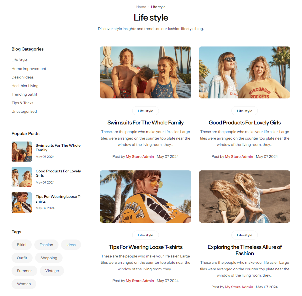
**Section width:** You can choose among Fluid container, Full width, Stretch width for the banner layout.
**Sidebar position:** Determine the placement of the sidebar in relation to your content to complement your page layout and user experience.
### Blog
**Layout:** Opt for a grid or list arrangement to best display your content.
**Items to show:** Determine the total number of products to showcase.
**Items per row:** Specify the number of items per row for organizing your content, applicable for grid layouts.
**Column gap:** Adjust the space between columns to achieve a balanced and neat presentation.
**Pagination type:** Choose the style of pagination from default, load more, or infinite scrolling to enhance navigation through your content.
**Button load more label:** Input content here to be displayed as the button label.
### Promotion image
You can upload an image to serve as a visual representation for the link you select.
**Position:**
### Posts settings
**Image ratio:** Offers multiple preset choices along with the option for a custom ratio to fit your specific needs.
**Custom ratio:** Set an aspect ratio based on your preference.
**Readmore button style:** Determine the style for the button.
### Mobile options and Section padding
**Items per row:** In mobile view, the number of items displayed on each row in the grid layout can be customized to suit your preferences and the overall design of your site.
Section padding allows you to specify the space between this section and the preceding or following sections, or both.
.png?alt=media)
.png?alt=media)
.png?alt=media)
.png?alt=media)
.png?alt=media)