> For the complete documentation index, see [llms.txt](https://nextsky.gitbook.io/purity-theme/llms.txt). Markdown versions of documentation pages are available by appending `.md` to page URLs; this page is available as [Markdown](https://nextsky.gitbook.io/purity-theme/collection-and-product-page/collection-page/page-template-sections/sub-collection.md).

# Sub collection

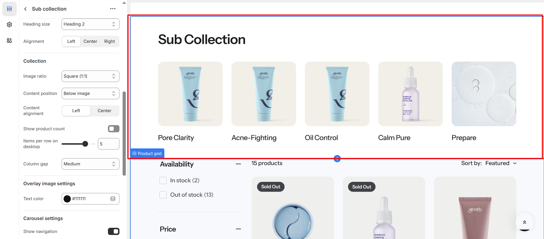
<figure><img src="https://1059363070-files.gitbook.io/~/files/v0/b/gitbook-x-prod.appspot.com/o/spaces%2FRcDJSoM26kdEZlVFekVW%2Fuploads%2FBwlBNrv9pDcVMH3lBiiv%2FScreenshot_140.png?alt=media&amp;token=c896e5c6-5436-40c8-9992-fbbc59f11523" alt=""><figcaption></figcaption></figure>

Section settings

#### General settings <a href="#general-setting" id="general-setting"></a>

<table><thead><tr><th width="200">Setting</th><th>Description</th></tr></thead><tbody><tr><td><strong>Section width</strong></td><td><p>3 options for container</p><ul><li><strong>Stretch width</strong>: span the section width regardless of screen size.</li><li><strong>Fixed width</strong>: depends on your page content width in <strong>Theme settings</strong> <strong>-></strong> <strong>Layout</strong>.</li><li><strong>Full width</strong>: takes up the entire space on the page and it usually resizes itself to fit the size of the screen.</li></ul></td></tr><tr><td><strong>Color scheme</strong></td><td>Select colors from <strong>Theme settings -> Colors</strong></td></tr></tbody></table>

#### Section header <a href="#general-setting" id="general-setting"></a>

<table><thead><tr><th width="200">Setting</th><th>Description</th></tr></thead><tbody><tr><td><strong>Heading</strong></td><td>The title of the section</td></tr><tr><td><strong>Enable heading underline animation</strong></td><td>Enable heading underline animation</td></tr><tr><td><strong>Underline style</strong></td><td>Select Underline style</td></tr><tr><td><strong>Underline color</strong></td><td>Customize Underline color</td></tr><tr><td><strong>Description</strong></td><td>The description of the section</td></tr><tr><td><strong>Heading size</strong></td><td><p>The size of the title:</p><ul><li><strong>Small</strong></li><li><strong>Medium</strong></li><li><strong>Large</strong></li></ul></td></tr><tr><td><strong>Alignment</strong></td><td><p>The position of the heading and description.</p><ul><li><strong>Left</strong></li><li><strong>Center</strong></li><li><strong>Right</strong></li></ul></td></tr></tbody></table>

#### Collection <a href="#blog-posts" id="blog-posts"></a>

<table><thead><tr><th width="200">Setting</th><th>Description</th></tr></thead><tbody><tr><td>I<strong>mage ratio</strong></td><td><p>"Image ratio" refers to the proportional relationship between the width and height of an image.</p><p>4 options for image ratio</p><ul><li><strong>Adapt to image</strong></li><li><strong>Square (1:1)</strong></li><li><strong>Portrait (3:4)</strong></li><li><strong>Landscape (4:3)</strong></li></ul></td></tr><tr><td><strong>Content position</strong></td><td><p>2 options for information position</p><ul><li><strong>Overlay image</strong>: text overlay on an image</li><li><strong>Bellow image</strong>: text beneath the image</li></ul></td></tr><tr><td><strong>Content alignment</strong></td><td><p>2 options for content alignment</p><ul><li><strong>Left</strong></li><li><strong>Center</strong></li></ul></td></tr><tr><td><strong>Show product count</strong></td><td>Display the product count for the collection.</td></tr><tr><td><strong>Items per row on desktop</strong></td><td>The number of collections displayed per row on a desktop screen</td></tr><tr><td><strong>Column gap</strong></td><td>The spacing between collections.</td></tr></tbody></table>

#### Overlay image settings

<table><thead><tr><th width="200">Setting</th><th>Description</th></tr></thead><tbody><tr><td><strong>Text color</strong></td><td>Defines the color of the text within this section or block.</td></tr></tbody></table>

#### Carousel settings

<table><thead><tr><th width="200">Setting</th><th>Description</th></tr></thead><tbody><tr><td><strong>Enable carousel</strong></td><td>When enabled, the section will be displayed in carousel format</td></tr><tr><td><strong>Show navigation</strong></td><td>Display the next and back controls for the carousel</td></tr><tr><td><strong>Show pagination</strong></td><td>Display the pagination for the carousel</td></tr><tr><td><strong>Reveal next slide</strong></td><td>Display a part of the upcoming slide.</td></tr><tr><td><strong>Items per row on mobile</strong></td><td>Number of columns to display on mobile devices.</td></tr></tbody></table>

#### Section padding <a href="#section-padding" id="section-padding"></a>

<table><thead><tr><th width="200">Setting</th><th>Description</th></tr></thead><tbody><tr><td><strong>Top</strong></td><td>Customize the top margin of the section</td></tr><tr><td><strong>Bottom</strong></td><td>Customize the bottom margin of the section</td></tr></tbody></table>

#### Section divider

<table><thead><tr><th width="213">Setting</th><th>Description</th></tr></thead><tbody><tr><td><strong>Show divider</strong></td><td>Toggles the visibility of a horizontal divider line within the section.</td></tr><tr><td><strong>Top divider</strong></td><td>Shape of the divider at the top of the section: <strong>None</strong>, <strong>Line</strong> (default), <strong>Wave</strong>, <strong>Curve out</strong>, or <strong>Curve in</strong>. Hidden when the section above has a Wave or Curve bottom divider.<br><em>* Note: Only appears when</em> <strong>Show divider</strong> <em>is enabled</em></td></tr><tr><td><strong>Bottom divider</strong></td><td>Shape of the divider at the bottom of the section: <strong>None</strong> (default), <strong>Line</strong>, <strong>Wave</strong>, <strong>Curve out</strong>, or <strong>Curve in</strong>. <strong>Line</strong> is hidden when the section below has a Wave or Curve top divider.<br><em>* Note: Only appears when</em> <strong>Show divider</strong> <em>is enabled</em></td></tr></tbody></table>
