> For the complete documentation index, see [llms.txt](https://nextsky.gitbook.io/purity-theme/llms.txt). Markdown versions of documentation pages are available by appending `.md` to page URLs; this page is available as [Markdown](https://nextsky.gitbook.io/purity-theme/group-sections/banners/parallax-split.md).

# Parallax split

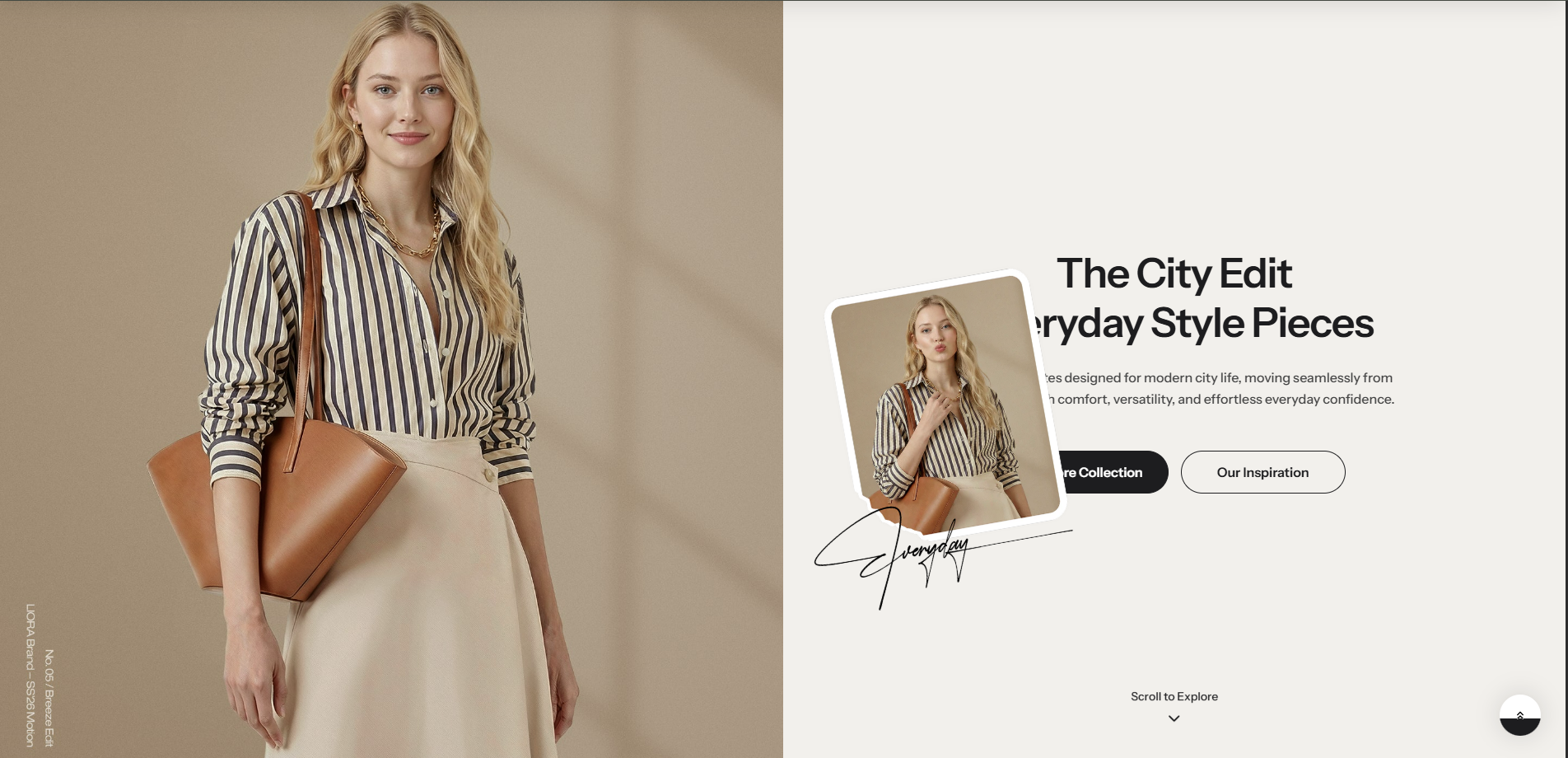
<figure><img src="https://1059363070-files.gitbook.io/~/files/v0/b/gitbook-x-prod.appspot.com/o/spaces%2FRcDJSoM26kdEZlVFekVW%2Fuploads%2FyyA1570QuCBGExqwh9Y9%2Fimage.png?alt=media&amp;token=7ff719a2-ab9d-4d62-a7f3-e32e397e46e2" alt=""><figcaption></figcaption></figure>

### Section settings <a href="#section-settings" id="section-settings"></a>

#### General settings <a href="#general-setting" id="general-setting"></a>

| Setting           | Description                                                                                                                                                                                                                                                                                                                                                                                                                             |
| ----------------- | --------------------------------------------------------------------------------------------------------------------------------------------------------------------------------------------------------------------------------------------------------------------------------------------------------------------------------------------------------------------------------------------------------------------------------------- |
| **Section width** | <p>3 options for container</p><ul><li><strong>Stretch width</strong>: span the section width regardless of screen size.</li><li><strong>Fix width</strong>: depends on your page content width in <strong>Theme settings</strong> <strong>-></strong> <strong>Layout</strong>.</li><li><strong>Expand full width</strong>: takes up the entire space on the page and it usually resizes itself to fit the size of the screen.</li></ul> |
| **Color scheme**  | Choose colors from the predefined palette in [**Colors**](https://nextsky.gitbook.io/purity-theme/theme-settings/colors) to ensure consistency with your store’s overall design scheme.                                                                                                                                                                                                                                                 |

#### Image <a href="#blog-posts" id="blog-posts"></a>

| Setting                    | Description                                                                                                       |
| -------------------------- | ----------------------------------------------------------------------------------------------------------------- |
| **Image**                  | Upload desired image ***(696px x 500px recommended)***                                                            |
| **Image width**            | Customize the size of the image                                                                                   |
| **Desktop image position** | <p>2 options for desktop image position</p><ul><li><strong>Left</strong></li><li><strong>Right</strong></li></ul> |
| **Subheading**             | Subheading content                                                                                                |
| **Heading**                | Heading content                                                                                                   |
| **Text color**             | Define text color                                                                                                 |

#### Parallax image

| Setting   | Description          |
| --------- | -------------------- |
| **Image** | Upload desired image |

#### Content settings <a href="#content-settings" id="content-settings"></a>

| Setting                        | Description                                                                                                                                             |
| ------------------------------ | ------------------------------------------------------------------------------------------------------------------------------------------------------- |
| **Desktop vertical alignment** | <p>3 options for the desktop content position</p><ul><li><strong>Top</strong></li><li><strong>Middle</strong></li><li><strong>Bottom</strong></li></ul> |
| **Content alignment**          | <p>3 options for the content alignment</p><ul><li><strong>Left</strong></li><li><strong>Center</strong></li><li><strong>Right</strong></li></ul>        |

#### Section padding <a href="#section-padding" id="section-padding"></a>

| Setting    | Description                                |
| ---------- | ------------------------------------------ |
| **Top**    | Customize the top margin of the section    |
| **Bottom** | Customize the bottom margin of the section |

#### Section divider

<table><thead><tr><th width="342.7778015136719">Setting</th><th>Description</th></tr></thead><tbody><tr><td><strong>Show divider</strong></td><td>Toggles the visibility of a horizontal divider line within the section.</td></tr></tbody></table>

### Block settings <a href="#block-settings" id="block-settings"></a>

#### Heading, Subheading, Description

| Setting                              | Description                                                                                                                |
| ------------------------------------ | -------------------------------------------------------------------------------------------------------------------------- |
| **Heading, Subheading, Description** | Custom title block                                                                                                         |
| **Width**                            | <p>2 options for content's width:</p><ul><li><strong>Fit</strong></li><li><strong>Fill</strong></li></ul>                  |
| **Typography - Preset**              | This element inherits the font preset defined in the theme settings, ensuring consistent typography across the storefront. |
| **Background**                       | Toggle this setting to make the background options visible and configurable for this section.                              |
| **Background color**                 | Defines the background color for this section.                                                                             |
| **Corner radius**                    | Adjust this value to create sharp or rounded edges, enhancing the visual style of the component.                           |
| **Padding top/bottom**               | Adjust these values to control the amount of space between the section’s content and its outer edges.                      |

#### Button <a href="#button" id="button"></a>

| Setting            | Description                                                                                                                             |
| ------------------ | --------------------------------------------------------------------------------------------------------------------------------------- |
| **Button label**   | Custom name button, if left empty, the button will be hidden                                                                            |
| **Button link**    | The link URL you want to add                                                                                                            |
| **Button type**    | <p>The style of the button</p><ul><li><strong>Primary</strong></li><li><strong>Outline</strong></li><li><strong>Link</strong></li></ul> |
| **Spacing bottom** | Spacing between the button and the next component                                                                                       |

#### Highlight text

| Setting              | Description                                                    |
| -------------------- | -------------------------------------------------------------- |
| **Subheading**       | Custom title block                                             |
| **Size**             | The size of highlighted content                                |
| **Select icon**      | Choose the icon to show along with the highlighted content     |
| **Background color** | Setting the background color                                   |
| **Text color**       | Setting the content color                                      |
| **Uppercase**        | Uppercasing the highlighted content                            |
| **Spacing bottom**   | Spacing between the highlighted content and the next component |