> For the complete documentation index, see [llms.txt](https://nextsky.gitbook.io/purity-theme/llms.txt). Markdown versions of documentation pages are available by appending `.md` to page URLs; this page is available as [Markdown](https://nextsky.gitbook.io/purity-theme/group-sections/blog/blog-posts.md).

# Blog posts

**Blog posts** on a website diversify content, enhance SEO, engage audiences, build authority, educate customers, encourage social sharing, and support lead generation, contributing to an enriched website experience.

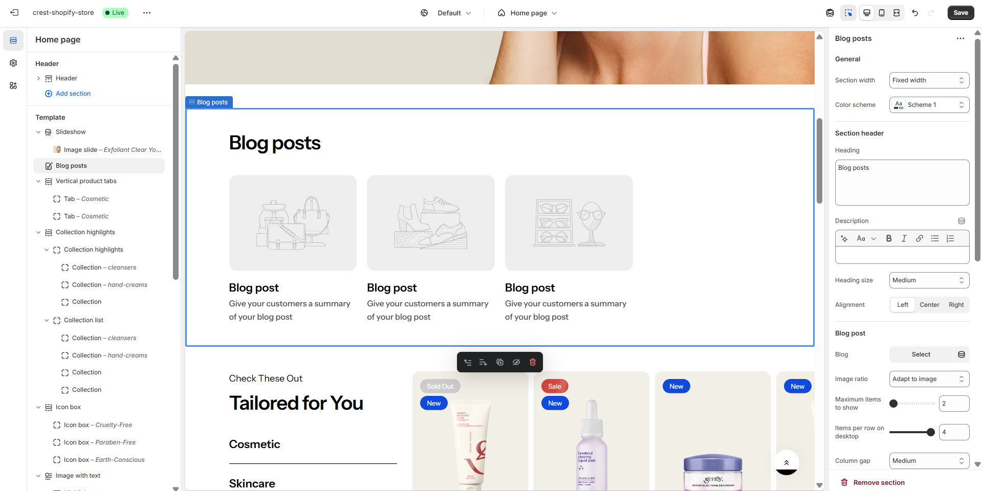
<figure><img src="https://1059363070-files.gitbook.io/~/files/v0/b/gitbook-x-prod.appspot.com/o/spaces%2FRcDJSoM26kdEZlVFekVW%2Fuploads%2FKPwOMnc3jQu0XX9HfRjk%2Fimage.png?alt=media&amp;token=c977ee03-85a1-4ebf-a9c2-757a2604a573" alt=""><figcaption></figcaption></figure>

### Section settings <a href="#section-settings" id="section-settings"></a>

#### General settings <a href="#general-setting" id="general-setting"></a>

<table><thead><tr><th width="211">Setting</th><th>Description</th></tr></thead><tbody><tr><td><strong>Section width</strong></td><td><p>3 options for container</p><ul><li><strong>Stretch width</strong>: span the section width regardless of screen size.</li><li><strong>Fixed width</strong>: depends on your page content width in <strong>Theme settings</strong> <strong>-></strong> <strong>Layout</strong>.</li><li><strong>Full width</strong>: takes up the entire space on the page and it usually resizes itself to fit the size of the screen.</li></ul></td></tr><tr><td><strong>Color scheme</strong></td><td>Select colors from <strong>Theme settings -> Colors</strong></td></tr><tr><td><strong>Subheading</strong></td><td>Use the subheading to provide additional context or supporting information.</td></tr><tr><td><strong>Heading</strong></td><td>The primary text element used to introduce or label the content within this section.</td></tr><tr><td><strong>Enable heading underline animation</strong></td><td>Enable heading underline animation</td></tr><tr><td><strong>Underline style</strong></td><td>Select Underline style</td></tr><tr><td><strong>Underline color</strong></td><td>Customize Underline color</td></tr><tr><td><strong>Description</strong></td><td>A text element used to provide additional details or supporting information related to the heading or content of the section.</td></tr><tr><td><strong>Heading size</strong></td><td><p>The size of the title:</p><ul><li><strong>Small</strong></li><li><strong>Medium</strong></li><li><strong>Large</strong></li></ul></td></tr><tr><td><strong>Alignment</strong></td><td><p>The position of the heading and description.</p><ul><li><strong>Left</strong></li><li><strong>Center</strong></li><li><strong>Right</strong></li></ul></td></tr></tbody></table>

#### Blog post <a href="#blog-posts" id="blog-posts"></a>

<table><thead><tr><th width="208">Setting</th><th>Description</th></tr></thead><tbody><tr><td><strong>Blog post type</strong></td><td>Decide to show the blog posts in a specific Category or from a selected list.</td></tr><tr><td><strong>Blog</strong></td><td>Which blog you want to display blog posts from. Defaults to the first blog alphabetically on your <a href="https://shopify.com/admin/blogs">Blogs page.</a></td></tr><tr><td><strong>Image ratio</strong></td><td><p>The image ratio for the featured images of the blog posts:</p><ul><li><strong>Adapt to image</strong> - Uses the aspect ratio of the images. This prevents the images from being cropped.</li><li><strong>Portrait</strong> - Crops the images to use a 3:4 ratio.</li><li><strong>Square</strong> - Crops the images to use a 1:1 ratio</li><li><strong>Landscape</strong> - Crops the images to use a 4:3 ratio</li></ul></td></tr><tr><td><strong>Maximum items to show</strong></td><td>Limit the display of the number of posts. Minimum: 2. Maximum: 12</td></tr><tr><td><strong>Items per row on desktop</strong></td><td>Number of columns to display on desktop computers. Minimum: 2. Maximum: 4.</td></tr><tr><td><strong>Column gap</strong></td><td><p>4 options for column gap</p><ul><li><strong>No gap</strong></li><li><strong>Small</strong></li><li><strong>Medium</strong></li><li><strong>Large</strong></li></ul></td></tr><tr><td><strong>Show category</strong></td><td>Display blog categories</td></tr><tr><td><strong>Show tags</strong></td><td>Display tags associated with each blog post</td></tr><tr><td><strong>Show date</strong></td><td>Display post creation date</td></tr><tr><td><strong>Show author</strong></td><td>Display post author</td></tr><tr><td><strong>Show excerpts</strong></td><td>Display a short post excerpt</td></tr></tbody></table>

#### Carousel settings <a href="#settings-for-carousel" id="settings-for-carousel"></a>

<table><thead><tr><th width="209">Setting</th><th>Description</th></tr></thead><tbody><tr><td><strong>Enable carousel</strong></td><td>When enabled, the section will be displayed in carousel format</td></tr><tr><td><strong>Show navigation</strong></td><td>Display the next and back controls for the carousel</td></tr><tr><td><strong>Show pagination</strong></td><td>Display the pagination for the carousel</td></tr><tr><td><strong>Reveal next slide</strong></td><td>Display a part of the upcoming slide.</td></tr><tr><td><strong>Items per row on mobile</strong></td><td>Number of columns to display on mobile devices.</td></tr></tbody></table>

#### Section padding <a href="#section-padding" id="section-padding"></a>

<table><thead><tr><th width="213">Setting</th><th>Description</th></tr></thead><tbody><tr><td><strong>Top</strong></td><td>Customize the top margin of the section</td></tr><tr><td><strong>Bottom</strong></td><td>Customize the bottom margin of the section</td></tr></tbody></table>

#### Section divider

<table><thead><tr><th width="213">Setting</th><th>Description</th></tr></thead><tbody><tr><td><strong>Show divider</strong></td><td>Toggles the visibility of a horizontal divider line within the section.</td></tr></tbody></table>
