Collection tab

Steps
In the theme editor (Customize), click Add section
Locate Collection tab
Save
Section settings
Section header and General
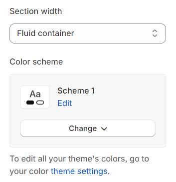
Section width: You can choose among Fluid Container, Stretch width, Full width for the layout or just leave it with the default layout of the video.
Color scheme: You are allowed to change text color, background color, etc. with preset color.
Use the provided text fields to add a suitable heading/description. Leave any of them blank if you do not want to display them.
Adjust the text alignment (left/center/right) along with font size.
Layout Header: Choose layout for header.

Collection tab
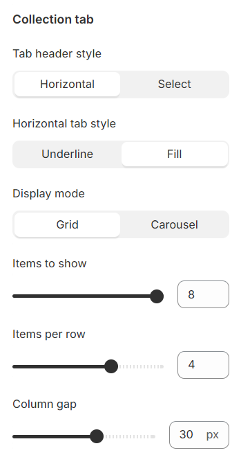
Tab header type: You have the option to choose between two types of tab headers, offering different styles for layout customization.
Horizontal tab style: For the horizontal tab header type, there are two designs available to select from, providing variety in presentation.
Display mode: There are two types of product displays to choose from: grid and carousel, each offering a unique way to showcase products.
Items to show: This setting allows you to determine the number of products displayed in a single tab, giving you control over the quantity of items visible at once.
Items per row: This option lets you specify the number of products featured in each row, allowing for a customized layout.
Column gap: Adjust the spacing between products to ensure a clean and organized appearance, enhancing the shopping experience.
Settings for carousel
Show Next/Back: Display arrows to navigate to the next or previous item.
Show Next Back in Heading: Enable this option to show the next/previous navigation arrows within the carousel heading. This feature only appears when the title is aligned left or right.
Dot: Choose whether to display navigation dots for the carousel.
Style Dot: Choose the design style for the carousel navigation dots.
Infinite Slide: Enable this option for the carousel to loop continuously, creating an infinite slide effect.
Auto Change Slides: Set the interval time (in seconds) for the automatic slide transition.
Reveal next slide: Allow a part of the next slide to be visible while the previous one is still displayed.

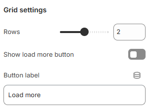
Grid settings
Rows: Adjust the number of rows to display products, allowing for a customized product showcase layout.
Show "Load More": Enable a "Load More" button to allow users to access additional products without overwhelming the initial page load.
Button label: Customize the text label on the button to match your site's tone and call-to-action.
Mobile options
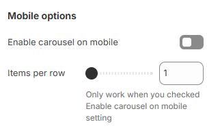
Enable carousel on mobile: Turn on this option to enable the carousel functionality for mobile devices, providing a seamless scrolling experience.
Items per row: Set the number of items displayed per row on mobile devices for optimal layout and usability.
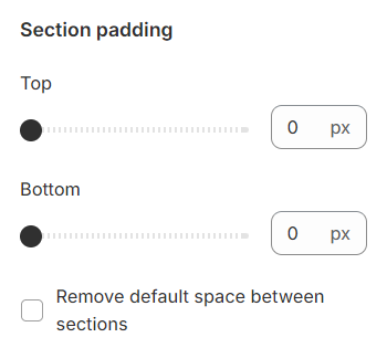
Section padding
Section padding allows you to specify the space between this section and the preceding or following sections, or both.
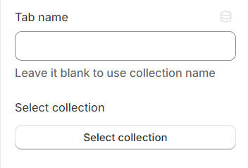
Block settings
Tab name: This will be shown in place of the collection name if it's not left empty, allowing for customized or more descriptive titles.
Select collection: Choose the link that leads to the desired collection, providing a direct pathway for users to explore specific products or categories.
Last updated