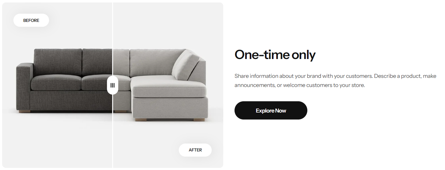
Image comparison slider
Image comparison slider shows 2 images next to each other which let customers see the differences between them.
You can setup 2 individual pairs of images for mobile and desktop.
Section settings
Section header and General
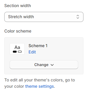
Section width: Can choose among Default, Fluid Container, Stretch width, Full width for the section layout.
Color scheme: Set text color and background color with preset scheme
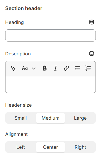
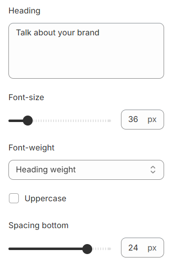
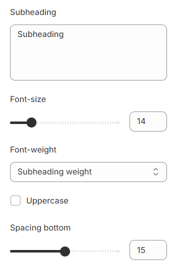
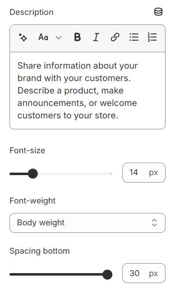
Heading: Use the provided text fields to add a suitable heading/description. Leave any of them blank if you do not want to display them.
Alignment: Adjust text alignment (left/center/right) relative to the container.
Before/After settings
Before/After Image: Configure the display to show a before and an after image.
Before/After Text: Use the provided text fields to add a suitable heading/description. Leave any of them blank if you do not want to display them.
Design: Select display style the button and label for the slider.
Width: Adjust the width of the slider to fit the visual layout and content requirements of your webpage or presentation.
Position: Choose to place the content on the left or right side.
Image ratio: Select a preset ratio for the images.
Custom ratio: Appears when Image ratio selects custom, helping to determine the custom ratio.

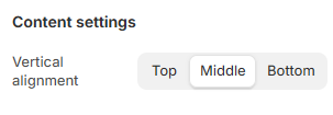
Content settings
Vertical alignment: Adjust the vertical alignment of content to position it at the top, center, or bottom within its container.
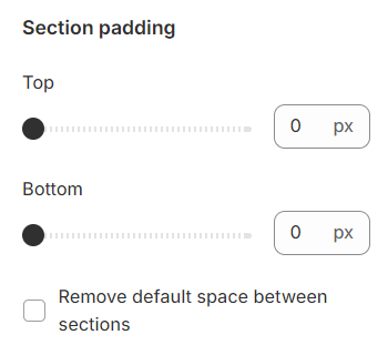
Section padding
Section padding: Allows you to specify the space between this section and the preceding or following sections, or both.
Block settings
Each block includes settings for content such as font size, font weight, text transformation, and spacing.
Heading
Subheading
Description
Button
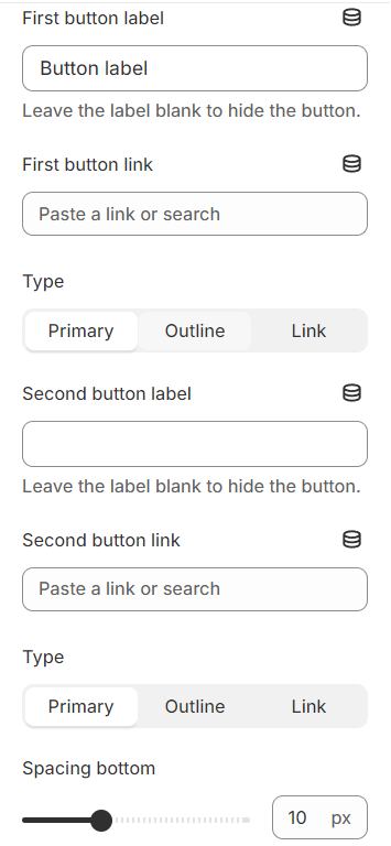
Button label: Use the text fields provided to add a label to the button. Leave any fields blank if you don't want them displayed.
Button link: Paste the link (URL) that will be redirected when clicked. You can paste the link directly or find the link in the list (product, collection, page, blog…).
Type: Choose a display style for the button: - Primary – The button stands out, the main color of the brand - Outline – The border, softer - Link – Display as a link, no background, no frame
Last updated