> For the complete documentation index, see [llms.txt](https://nextsky.gitbook.io/glozin-theme/llms.txt). Markdown versions of documentation pages are available by appending `.md` to page URLs; this page is available as [Markdown](https://nextsky.gitbook.io/glozin-theme/theme-sections/slideshow.md).
# Slideshow
Combine images, text, and call-to-action buttons in your slideshow
A slideshow is a quick and interactive way to showcase content and information on your site. Slideshow lets you display your most popular products/collections or shout out about what's new with a call-to-action button.
{% hint style="success" %}
Steps
1. In the theme editor (**Customize**), click **Add section**
2. Locate **Slideshow**
3. **Save**
{% endhint %}
## Section settings
### General setting
**Section width:** You can choose among Fluid container, Stretch width, Full width for the layout or just leave it with the default layout of the video.
**Slide height:** The image height can be configured to fit the full screen, maintain its original height, or be adjusted to a custom height.
### Custom height
Setting the slide height to custom allows you to personally configure the height of the slide according to your specific requirements, offering complete control over the slide's appearance.
**Color scheme:** Set text color and background color with preset scheme
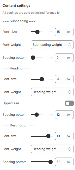
### Content settings
Adjust the font size, font weight, and bottom spacing for content parts, including subheadings, headings, and descriptions, to match your design preferences.
### Carousel settings
**Show Next/Back:** Display arrows to navigate to the next or previous item.
**Dot:** Choose from different types of pagination options.
**Desktop dots position:** Set the position of navigation dots on desktop view to left, center, or right for better alignment with your layout.
**Change slide every:** Configure the time interval for changing slides.
**Reveal next slide:** Allow a part of the next slide to be visible while the previous one is still displayed.
**Show content below image:** Enable this option to display content, such as headings or descriptions, below the image on mobile devices for a more compact and organized layout.
### Section padding:
Section padding allows you to specify the space between this section and the preceding or following sections, or both.
## Blocks settings
### Image settings
You can add images for desktop and mobile versions separately.
{% hint style="info" %}
1920x900px is recommended for desktop and 600x480px is recommended for mobile.
{% endhint %}
**Local video:** Enable this option to assign a specific video to each slide, enhancing visual engagement and interactivity.
**Add focal point:** This feature helps you select the most important part of an image for your store. It ensures that the focal points of the image always remain visible, even if a section crops the image to fit the layout.
{% hint style="info" %}
Please follow this [link](https://help.shopify.com/en/manual/online-store/images/theme-images) for more information.
{% endhint %}
### **Content**
Use the provided text fields to add a suitable heading/subheading/description. Leave any of them blank if you do not want to display them.
### Content settings
**Content alignment:** Options to align text left, center, or right are available.
**Desktop content position:** Vertically and horizontally align the content for optimal positioning.
**Content padding**: Configure the padding for the content box.
### Content box and Mobile options
You can set a background color and adjust the opacity for the it.
**Content alignment:** Options to align text left, center, or right are available on mobile.
.png?alt=media)
.png?alt=media)
.png?alt=media)
.png?alt=media)

.png?alt=media)
.png?alt=media)
.png?alt=media)
.png?alt=media)
.png?alt=media)